Understanding how gene expression changes over time and in response to different conditions is crucial in biological research. On this matter, timecourse differential expression analysis allows researchers to track gene expression at multiple time points, uncovering dynamic patterns that provide insights into complex biological processes such as development, disease progression, and response to treatments.
While there are many algorithms available for conducting timecourse differential expression analyses, maSigPro stands out due to its robustness and flexibility in handling complex experimental designs, since it allows introducing both time and conditions to the test. These features make maSigPro a valuable tool for researchers aiming to dissect temporal gene expression data.
However, understanding how maSigPro works and thus interpreting its results can be challenging. To assist researchers in navigating these results, this blog post will provide a guide on understanding and interpreting maSigPro outputs so, by the end, hopefully, you will be equipped with the knowledge to extract meaningful insights from your timecourse gene expression data.
maSigPro Algorithm
The maSigPro algorithm is designed to analyze gene expression data over time, accommodating various experimental conditions. In this blog, we will go through a detailed yet simplified explanation of how maSigPro works.
Polynomial Regression Model
maSigPro fits a polynomial regression model to the expression data of each gene in the dataset. The model considers time and, if applicable, different experimental conditions. We will start the explanation with a scenario modeled only by time. In this case, the expression of each gene is represented by the following formula (Figure 1) →
For simplicity, we show a polynomial of degree two, but the polynomial can have as many degrees as the total number of time points minus one. Each additional degree represents a further change in curvature. However, using a high number of degrees is discouraged since it may result in model overfitting. Usually, a polynomial of degree 2 is more than enough to model the gene expression, although a degree 3 may be appropriate in experimental setups with a big number of time points.
The values of the coefficients (β) will vary for each gene, reflecting their specific expression trends.
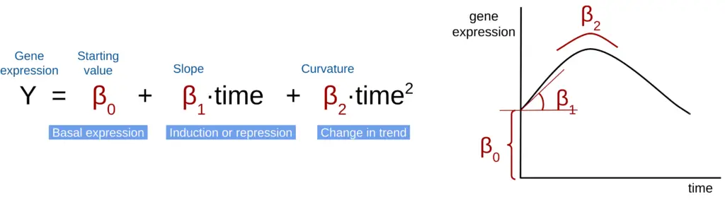
For example, genes with flat trends will only have a β0 but no β1 or β2. On the other hand, genes whose expression decreases over time will have a β0 and a negative β1 (indicating a downward slope). Moreover, abrupt changes in the expression will be translated into higher or lower values of β1.
Model Fitting
Initially, maSigPro fits a model to each gene, including all variables (beta coefficients). It then identifies genes with significant changes over time. Afterward, a second step is performed to select only those variables that significantly model the gene expression. This step involves computing the statistical significance of the regression coefficients (β values). Only variables with a P-value below a specified threshold (indicating an influence in the model) are retained.
For instance, if a gene’s expression consistently increases over time, the term β2 will be removed from the model due to the absence of curvature, rendering its P-value insignificant.
Multiple Condition Scenarios
In experiments with multiple conditions, more terms are added to the polynomial regression in Figure 1 to account for different conditions. Here is an example with a reference and one test condition (Figure 2) →
In this formula, the first part (in red) models the expression for the reference condition, while the subsequent terms model the expression for the test(s) condition(s) (in green). Dummy variables (D1) indicate the association with a specific experimental group, taking values of 0 or 1 based on the sample group.
In the example in Figure 2, a D1=0 will indicate that we are modeling the reference condition, and with a D1=1 we will add the terms modeling the test group.
The coefficients (betas) of each term, specify the difference with respect to the reference coefficients. For example, the β3 is the difference between the starting point in the test trend and the starting point in the reference trend (β0).
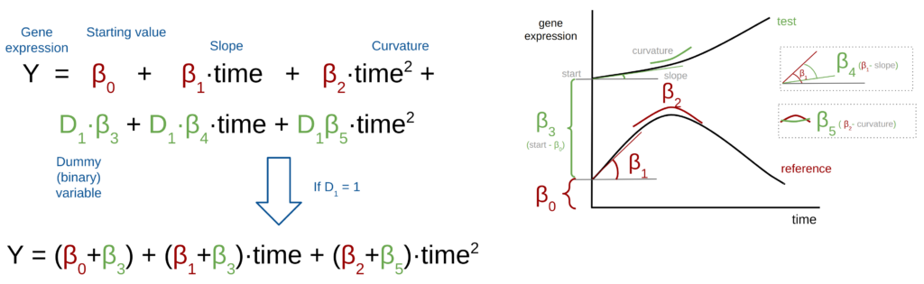
In the second step of maSigPro, if a regression coefficient associated with a dummy variable is significant, it indicates a difference between the reference and test conditions. For example, if the slope coefficients ( β1 and β4) differ between conditions, like in the example in Figure 2, the coefficient β4 will be statistically significant and this term will be retained in the final model.
By fitting these polynomial regression models and evaluating the significance of the coefficients, maSigPro effectively identifies genes with time-dependent expression changes across different experimental conditions.
Clustering
After identifying genes with significant expression changes and fitting the models, maSigPro performs a clustering step to group genes with similar expression patterns over time. This clustering is based on the regression coefficients from the polynomial models, allowing genes with comparable trends to be grouped together. By clustering these genes, maSigPro facilitates the identification of shared biological pathways or functions within groups of co-expressed genes, making it easier to interpret complex time-course data.
maSigPro Output
The output of maSigPro is primarily presented as a table containing all the significant coefficients for each gene, along with their associated P-values. This table is crucial for identifying differentially expressed genes, either over time or between different experimental conditions. Another important and interesting result is the gene clusters, which are groups of genes with similar gene expression trends.
Analyzing Gene Clusters
One of the most intuitive ways to interpret maSigPro results is by examining the gene clusters. These clusters are visualized in summary expression profile plots (Figure 3), which display the overall trends for each group of genes. For instance, you can easily observe whether a cluster of genes shows increasing or decreasing expression over time, or more complex patterns such as an initial increase followed by a decrease. Once you’ve identified clusters with interesting trends, you can perform a functional enrichment analysis to determine whether the genes within these clusters are associated with specific biological functions.
Focusing on Specific Trends
Another approach to analyzing maSigPro results is to focus on specific patterns within the data.
- Identifying specific trend patterns: This can be achieved by filtering genes by their β P-values. For instance, if you’re interested in genes that show a change in their expression trend, such as a curve, you would filter the results to include only those genes with a significant P-value in the Time² term.
- Comparing linear trends between conditions: If your focus is on genes with linear expression differences between a test condition and the reference condition, you will filter for genes with a significant P-value in the Time × Condition term. This term highlights genes whose expression trends differ significantly between conditions, reflecting differences in the slope or direction of expression over time.
By using these strategies, you can effectively narrow down the results to the most relevant genes and trends, facilitating deeper biological insights from your time-course data.
Example Use Case
Dataset
The dataset used in this blog consists of samples from Arabidopsis thaliana from two different lines, one resistant to the pathogen Bgh and another susceptible to it. In addition, each line was inoculated with two different isolates of the pathogen Bgh (A6 and K1). For each combination of plant line and pathogen, three replicates were taken at 4 different time points after inoculation (6h, 12h, 18h, and 24h), resulting in a total of 48 samples. The data is available in the GEO Database with accession GSE39463.
Analysis
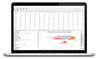
To explore how gene expression changes over time in response to pathogen inoculation, we used the maSigPro implementation in OmicsBox. This analysis was configured using the software’s intuitive wizard, where we specified thresholds for gene filtering, defined the experimental design, and selected the appropriate differential expression test (Figure 4).
Gene Filtering and Experimental Design
For this analysis, we set the gene filtering thresholds to 2 CPM (Counts Per Million) and required that at least 10 samples meet this threshold. It’s recommended that the sample threshold corresponds to the size of the smallest experimental group. In our dataset, this group size is 12 (a combination of plant line and pathogen isolate), so setting the threshold at 10 is a conservative choice that balances robustness with inclusivity.
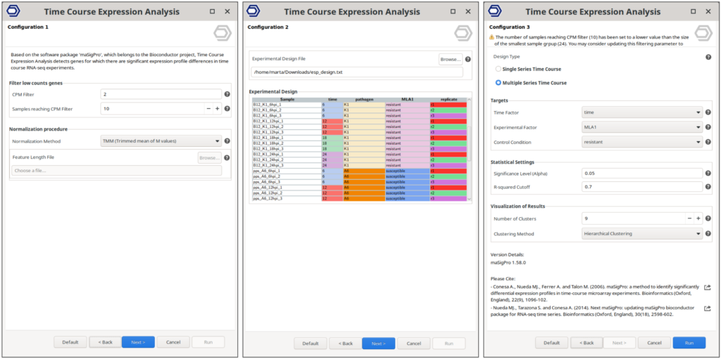
Given the experimental design, which involves multiple conditions, we opted for the “Multiple Series” design in OmicsBox. This setup allows us to test for gene expression changes both over time and across different conditions. The remaining settings, including normalization methods, statistical thresholds, and clustering parameters, were left at their default values to streamline the process.
💡 Gene Filtering Importance

Gene filtering is crucial for ensuring the reliability of your results. It's generally advisable to set filtering thresholds as high as possible without excluding too many genes.

Higher filtering thresholds ensure that only genes with robust expression across samples are analyzed, improving the signal-to-noise ratio and the reliability of the statistical tests used to identify differentially expressed (DE) genes. By reducing the number of genes in the dataset, you also decrease the number of statistical tests performed during DE analysis, helping to control the false discovery rate (FDR) and minimizing the risk of false positives.
Results
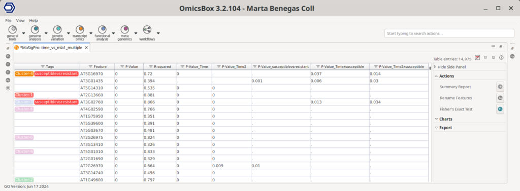
The maSigPro analysis produced a table listing the P-values for each polynomial term corresponding to every gene in the dataset (Figure 5). Additionally, genes that were identified as differentially expressed were tagged with a cluster label, facilitating further analysis. Various tools are available in the Side Panel to help interpret these results, such as options for visualizing gene clusters, performing functional enrichment analyses, etc.
Assessing the Results
Assessing the maSigPro results involves evaluating whether the chosen parameters are appropriate for your data. Here, we focus on two main visualization tools: the MDS plot and the Experiment-wide Expression profile plots.
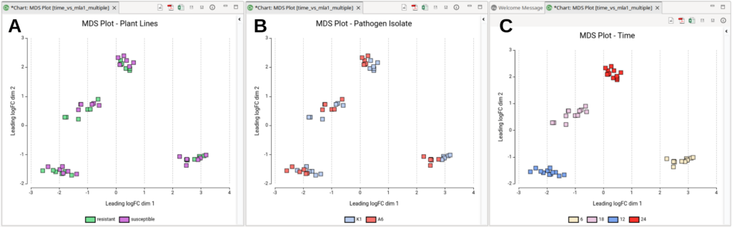
MDS Plot
The MDS plot coordinates represent the typical log2FoldChanges between samples. The “typical” log2FoldChange refers to the average or representative log2FC between pairs of samples, aggregated into a single distance measure. This measure captures the overall expression differences, rather than focusing on any specific gene. In the MDS plot, the distances between points (samples) reflect these aggregated differences, giving a visual representation of how similar or dissimilar the samples are in terms of their gene expression profiles. Moreover, if we color the plots by experimental conditions, we can assess their impact on the overall gene expression profile.
By coloring the MDS plots according to different experimental conditions, we can assess their impact on overall gene expression profiles. In Figure 6 we can see the MDS plot colored by plant line (Figure 6-A), pathogen isolate (Figure 6-B), and time (Figure 6-C). From these plots, it is evident that time is the primary source of variability between samples, as expected. The plant line seems to have minimal impact on overall gene expression since samples from different plant lines are intermixed within each time cluster. However, the pathogen isolate appears to influence gene expression, as some time-clusters are internally separated by this factor. In conclusion, time after inoculation and pathogen isolate are the two main sources of variation in this dataset, so it may be interesting to rerun the Timecourse Analysis choosing “pathogen” as the “Experimental Factor”.
Experiment-wide Expression Profile Plots
The Experiment-wide Expression profile plots display the expression levels across samples for genes within each cluster. These plots are useful for assessing whether the number of clusters is suitable for your data:
- Distinct Cluster Profiles: If each cluster shows a distinct profile, it indicates that the number of clusters is appropriate.
- Fuzzy Clusters: If clusters are not well-defined, it may suggest that the number of clusters is insufficient to capture all the variance.
- Similar Profiles Across Clusters: If clusters exhibit similar profiles, it may indicate that the number of clusters is too high.
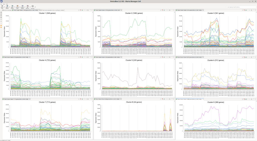
The number of clusters to compute is set before running the analysis and can be adjusted in the OmicsBox wizard. The default number of clusters is 9, which is generally effective, but it is advisable to review these plots to ensure the clustering is suitable for your data. In this example (Figure 7), each cluster displays a distinct profile, indicating that 9 clusters are a good fit for this dataset.
Moreover, these plots can provide insights into which samples have higher expression levels for genes within a particular cluster. For instance, genes in Cluster 8 are more highly expressed in the susceptible lines (pps) at the last time point, regardless of the pathogen isolate.
Interpreting the Results
Identifying Expression Trends
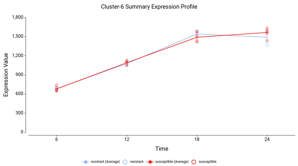
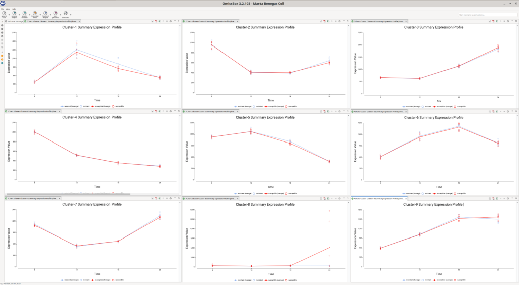
The Summary Expression Profiles provide an overview of the median expression levels of genes within each cluster across different time points. These plots are instrumental in identifying trends and patterns within the data.
By examining the Summary Expression Profile plots (Figure 8), we can discern various expression trends among the clusters. For example:
- Cluster 3: Genes in this cluster show a consistent increase in expression over time.
- Cluster 4: Genes in this cluster exhibit a decrease in expression over time.
- Cluster 8: Genes in this cluster increase their expression at the last time point, specifically in the susceptible lines. This observation aligns with what is seen in the Experiment-wide expression profile plots.
To further interpret these results, it is useful to assess if the genes of a particular cluster are involved in particular biological functions. This can be achieved with a functional enrichment analysis, which is available in OmicsBox through a Fisher’s Exact Test.
Functional Enrichment Analysis
To extract biological meaning from the identified trends, it is useful to determine if the genes within a particular cluster are associated with specific biological functions. This can be done using functional enrichment analysis, available in OmicsBox through a Fisher’s Exact Test (FET).
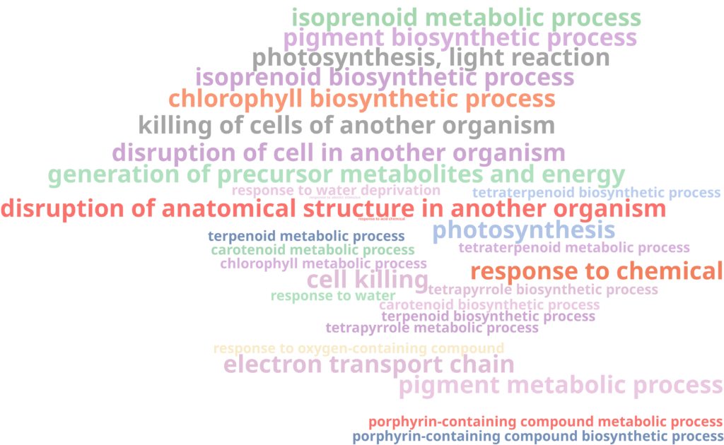
For instance, a FET of Cluster 3 revealed that genes in this cluster are enriched in functions related to the response to stress, photosynthesis, respiration, and defense mechanisms (Figure 9). The up-regulation of photosynthesis and respiration processes may indicate an increased demand for energy and metabolic activity in response to pathogen infection, as the plant ramps up energy production to fuel its defense mechanisms.
On the other hand, no enriched functions were found for genes in Custer 8. All gene ontology (GO) terms had an adjusted P-value of 1, indicating no significant enrichment. This lack of enrichment, combined with the small number of genes in the cluster, suggests that the observed signal might be spurious and not biologically meaningful.
Filtering for Specific Trends
Moreover, you can filter genes based on their coefficient’s P-values to investigate specific trends. For instance, if you are interested in genes with different slopes between susceptible and resistant lines, you can filter the results for differentially expressed genes (R-squared > 0.7 and general P-value < 0.05), while also ensuring a significant P-value (<0.05) in the Time × resistant term. This approach allows you to pinpoint genes that exhibit distinct expression behaviors in response to the experimental conditions.
Conclusion
In conclusion, maSigPro is a powerful tool for analyzing time-course gene expression data, offering insights into how genes respond over time and under different conditions. By fitting polynomial regression models and clustering genes with similar expression patterns, maSigPro facilitates the identification of key biological trends and functional relationships. Through careful assessment of MDS plots and expression profiles, researchers can ensure the chosen parameters suit their data, leading to robust and meaningful results. Functional enrichment analysis further enhances the interpretation, revealing the biological processes underlying the observed expression changes. Utilizing these strategies within OmicsBox makes complex bioinformatics analyses accessible and interpretable, driving forward our understanding of dynamic biological systems.
Bibliography
Conesa A, Nueda MJ, Ferrer A, Talón M. maSigPro: a method to identify significantly differential expression profiles in time-course microarray experiments. Bioinformatics. 2006 May 1;22(9):1096-102. doi:10.1093/bioinformatics/btl056
Nueda MJ, Tarazona S, Conesa A. Next maSigPro: updating maSigPro bioconductor package for RNA-seq time series. Bioinformatics. 2014;30(18):2598-2602. doi:10.1093/bioinformatics/btu333
OmicsBox – Bioinformatics Made Easy, BioBam Bioinformatics, August 8, 2024, https://www.biobam.com/omicsbox
")